Today, most people use their smartphones to browse the internet. Whether they want to read a blog, shop online, search for a service, or watch videos, they usually do it on a mobile device. Because of this, having a mobile-friendly website is no longer optional. It has become one of the most important parts of running a successful website.
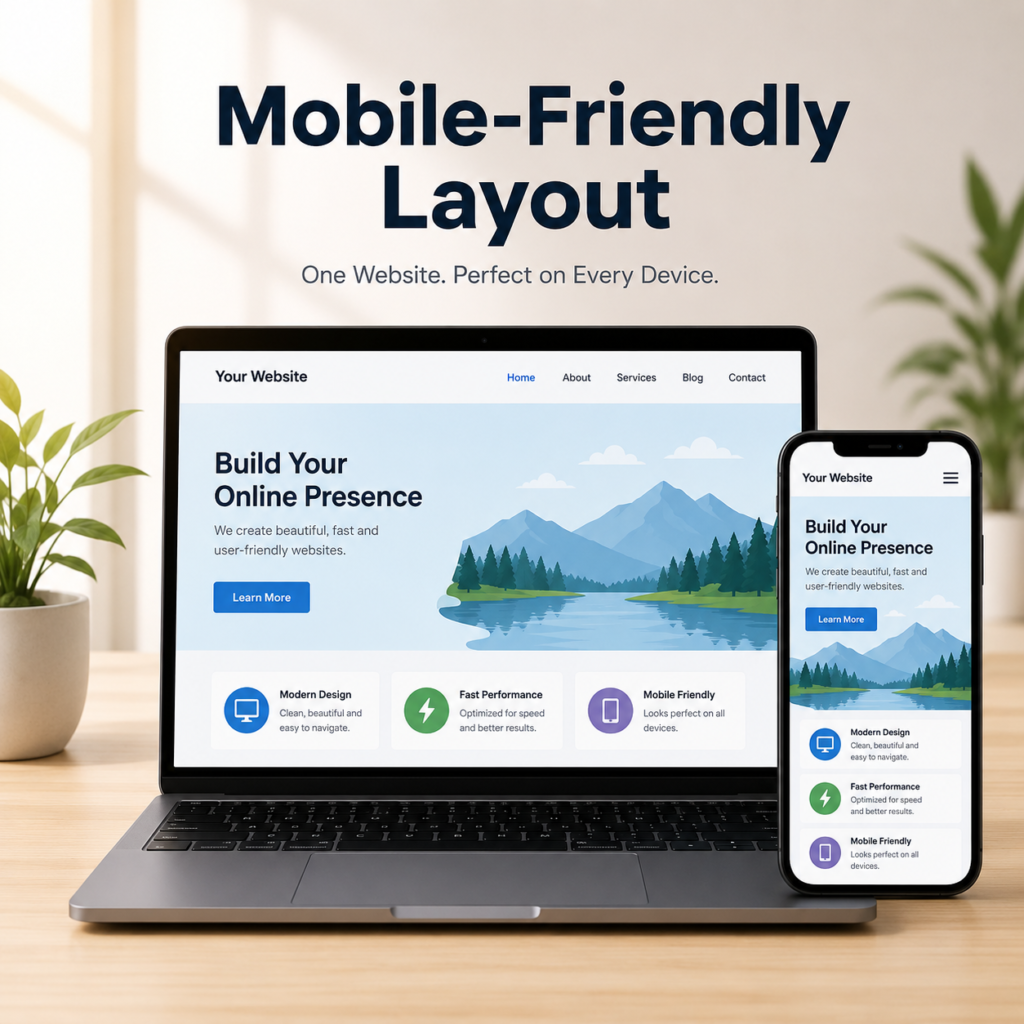
A mobile-friendly layout means your website looks good, loads properly, and is easy to use on phones and tablets. Visitors should not have to zoom in, scroll sideways, or struggle to click buttons. Everything should fit the screen naturally and be simple to read.
If your website is difficult to use on a mobile device, many visitors will leave within seconds. This can reduce your traffic, lower your search rankings, and affect your business. In this blog, we will understand why a mobile-friendly layout is important and how you can make sure every page renders and reads well on mobile devices.
What Is a Mobile-Friendly Layout?
A mobile-friendly layout is a website design that automatically adjusts to different screen sizes. Whether someone visits your website from a desktop, tablet, or smartphone, the page should display correctly without any problems.
A good mobile-friendly website keeps text readable, images properly sized, buttons easy to tap, and menus simple to use. The goal is to provide the same great experience for every visitor, no matter which device they are using.
Why Mobile-Friendly Design Matters
More people use mobile phones than desktop computers for browsing the internet. If your website only looks good on a large screen, you may lose a large number of visitors.
When users have a smooth experience on your website, they are more likely to stay longer, read your content, and visit more pages. This helps improve user engagement and sends positive signals to search engines.
A mobile-friendly website also creates a professional image. Visitors feel more confident when everything works smoothly.
Google Prefers Mobile-Friendly Websites
Google wants to provide the best experience for users. That is why it mainly looks at the mobile version of a website when deciding search rankings.
If your website is difficult to use on a smartphone, it may not perform as well in search results. A mobile-friendly layout improves your chances of ranking higher because it offers a better experience for visitors.
Although many SEO factors matter, mobile usability has become one of the important ones.
Confirm Your Pages Render Well on Mobile Devices
One of the most important things you should check is whether every page renders correctly on mobile devices.
Rendering simply means how your webpage appears after it loads. Everything should display properly without broken sections or overlapping content.
When checking your pages, make sure:
- The text is easy to read without zooming.
- Images fit the screen correctly.
- Buttons are large enough to tap comfortably.
- Menus open and work properly.
- There is no horizontal scrolling.
- Videos play correctly.
- Forms are simple to fill out.
- Pop-ups do not block the main content.
- The page layout remains clean on different screen sizes.
If visitors can comfortably read and use your website on their phones, your pages are rendering well.
Make Reading Easy on Small Screens
Reading on a mobile phone is different from reading on a desktop computer. Small screens require cleaner formatting.
Use short paragraphs instead of long blocks of text. Keep your sentences simple and direct. Add headings throughout your content so readers can quickly find the information they need.
A readable website encourages visitors to stay longer and continue exploring.
Use Responsive Design
Responsive design allows your website to automatically adjust according to the screen size.
Instead of creating separate websites for desktop and mobile users, one responsive design works across all devices.
This keeps your website consistent and easier to manage.
Responsive websites also reduce many display problems that happen on different screen sizes.
Choose Readable Font Sizes
Tiny text is one of the biggest problems on mobile websites.
Visitors should never have to zoom in just to read your content.
Use font sizes that are comfortable to read. Maintain enough spacing between lines and paragraphs so the page feels clean instead of crowded.
Simple formatting makes a huge difference.
Optimize Images for Mobile
Large images can slow down your website and create layout issues.
Resize images before uploading them and use the correct dimensions.
Images should automatically adjust to fit different screen sizes without becoming blurry or stretching outside the page.
Always add descriptive alt text to improve accessibility and SEO.
Make Buttons Easy to Tap
People use their fingers on mobile devices, not a mouse.
Buttons should be large enough to tap easily without clicking the wrong option.
Leave enough space between buttons and links so visitors do not become frustrated.
Simple navigation creates a better user experience.
Improve Page Speed
People expect websites to load quickly.
If a page takes too long to open, visitors often leave before reading anything.
Some easy ways to improve loading speed include:
- Compress images.
- Reduce unnecessary plugins.
- Use browser caching.
- Remove unused code.
- Choose reliable web hosting.
A faster website keeps visitors happy and supports better search rankings.
Keep Navigation Simple
Visitors should find what they need without confusion.
Avoid adding too many menu items.
A clean navigation menu helps users quickly reach important pages like:
- Home
- About
- Blog
- Services
- Contact
Simple navigation improves both user experience and SEO.
Test Your Website on Different Devices
Do not assume your website works perfectly just because it looks good on your own phone.
Test it on different smartphones, tablets, and browsers.
Check for:
- Broken layouts
- Missing images
- Text that is too small
- Buttons that do not work
- Slow loading pages
Testing helps you discover problems before your visitors do.
Avoid Annoying Pop-Ups
Pop-ups can be useful, but they should never cover the entire mobile screen.
If visitors cannot read your content because of large pop-ups, they may leave immediately.
Keep pop-ups small, easy to close, and only show them when necessary.
Keep Forms Short
Long forms are difficult to complete on mobile devices.
Only ask for information that is truly necessary.
Simple forms improve completion rates and create a better experience.
Regularly Check Mobile Performance
Websites should not be checked only once.
Every time you publish new content or update your design, test your pages again.
Make sure everything still displays correctly on mobile devices.
Regular checks help prevent small problems from becoming larger issues.
Benefits of a Mobile-Friendly Website
A mobile-friendly layout provides many long-term benefits.
Some of the biggest advantages include:
- Better user experience.
- Higher Google rankings.
- Lower bounce rate.
- Faster loading speed.
- More page views.
- Increased visitor trust.
- Better engagement.
- Higher conversion rates.
- Easier website navigation.
- Improved accessibility for all users.
These benefits help both website owners and visitors.
Final Thoughts
A mobile-friendly layout is one of the most important parts of a successful website. Since most people browse the internet using smartphones, your website should provide the same smooth experience on mobile as it does on a desktop.
Always confirm that every page renders correctly and reads comfortably on mobile devices. Text should be easy to read, images should fit properly, buttons should work smoothly, and navigation should be simple. Regular testing helps you identify problems early and keeps your website performing at its best.
A website that is fast, easy to use, and mobile-friendly not only keeps visitors happy but also improves your chances of ranking higher in search engines. By making mobile usability a priority, you create a better experience for everyone who visits your website.